
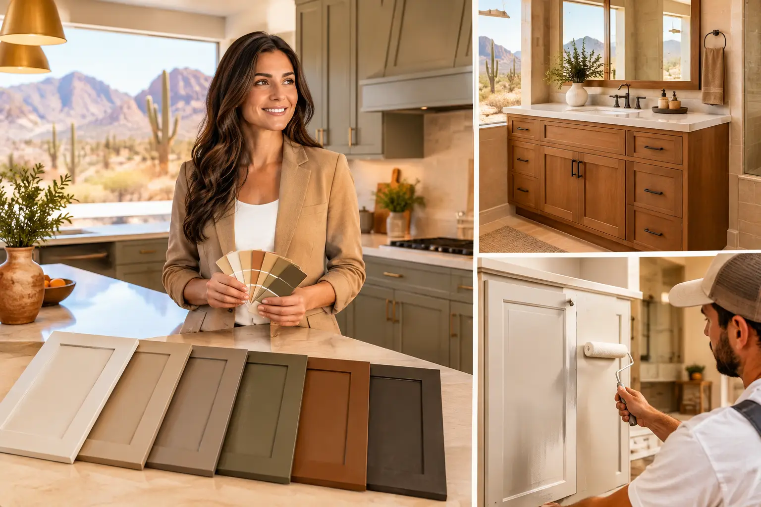
A cabinet color that looks perfect under showroom lighting can feel completely different in a Palm Desert kitchen at 2 p.m. Desert sunlight is bright, warm, and revealing. It can pull yellow from a white, make gray look blue, or turn an overly cool cabinet finish flat and uninviting. The best cabinet colors for desert homes work with that intense natural light while giving your kitchen or bathroom a clean, finished look that feels right all day.
For most homeowners, the goal is not to chase a trend. It is to choose a color that refreshes dated cabinetry, suits the home’s existing floors and counters, and delivers a major visual change without paying for full cabinet replacement. Professional cabinet refinishing makes that possible with a finish tailored to your space, style, and budget.
Why Desert Light Changes the Color Decision
Desert homes often have large windows, open floor plans, tile or stone floors, and warm exterior surroundings that influence interior color. A cabinet color is rarely viewed by itself. It sits beside the countertop, backsplash, wall paint, hardware, and the strong light coming through the room.
This is why a true bright white is not always the safest choice. In direct sun, a stark white can look harsh, while a white with a subtle cream, sand, or greige undertone feels softer and more intentional. The same principle applies to grays. Cool gray cabinets may look modern on a sample card but can feel disconnected from warm travertine, beige tile, or golden desert light.
The right choice depends on your home. A newer Palm Springs-inspired space may support a crisp white or deep charcoal accent island. A home with warm stone, wood beams, and earth-toned flooring may look better with creamy neutrals, muted green, or clay-inspired colors. Looking at large color samples in your actual room is far more reliable than choosing from a small paint chip.
Best Cabinet Colors for Desert Homes
The colors below are dependable starting points because they complement desert light rather than fight it. The final shade should still be selected around the fixed elements in your kitchen or bathroom.
Warm White and Soft Ivory
Warm white cabinets are a strong choice for homeowners who want a brighter, more updated kitchen without the clinical feel of pure white. Look for whites with a restrained cream, beige, or soft taupe base. These shades reflect light beautifully and pair easily with natural stone, brushed brass, matte black, and stainless hardware.
The trade-off is that some warm whites can read too yellow when paired with cool white quartz or blue-gray backsplash tile. If your counters are bright and cool, use a balanced off-white instead of a creamy ivory. Proper samples and lighting checks prevent that mismatch before refinishing begins.
Sand, Putty, and Light Greige
Desert-inspired neutrals do not have to mean beige cabinets from decades past. Modern sand, putty, mushroom, and light greige finishes add warmth while still looking clean and current. They are especially effective in kitchens with tan flooring, warm white walls, or natural stone countertops.
These shades are also practical. They tend to hide light dust, small scuffs, and everyday wear better than very dark cabinets or brilliant white finishes. For busy family kitchens, that can make the space feel polished with less visual maintenance.
Muted Sage and Olive Green
Soft green cabinetry brings contrast without overpowering a sun-filled room. Sage, eucalyptus, olive, and gray-green finishes work well with warm wood, white quartz, aged brass, and black hardware. They create a relaxed, grounded look that connects naturally to desert landscaping without becoming theme-driven.
A muted green is often more versatile than a bold emerald or forest green. Deep saturated greens can be striking, but they need enough light and enough surrounding neutral space to avoid making a smaller kitchen feel heavy. Consider using a darker green on an island or lower cabinets while keeping upper cabinets light.
Clay, Dusty Terracotta, and Soft Taupe
For homeowners who want more personality, clay-based shades can bring genuine warmth to a kitchen, laundry room, or bathroom vanity. Think softened terracotta, dusty rose-brown, cinnamon, or a muted adobe tone rather than bright orange. These colors look especially good with creamy walls, light oak accents, and textured tile.
This is a more style-specific direction, so balance matters. If your backsplash already has prominent color or pattern, a neutral taupe cabinet may be the better investment. A clay finish works best when it is the feature, not one more competing element in the room.
Charcoal, Deep Brown, and Nearly Black Accents
Dark cabinets can look sophisticated in desert homes, particularly on a large island, lower cabinets, or a bathroom vanity. Charcoal, dark espresso, and softened black provide strong contrast against pale counters and light walls. They also give a kitchen more architectural definition when the space has high ceilings or abundant natural light.
The downside is visibility. Dust, fingerprints, and water spots show more quickly on dark painted finishes, especially in high-use kitchens. Dark colors can also absorb visual light in a compact room. If you like the drama but want to keep the space open, use a dark shade strategically rather than covering every cabinet.
Match the Cabinet Color to the Room Conditions
A color should solve for the room you have, not the kitchen you saw online. Before choosing a finish, consider how the cabinets are used and what cannot easily be changed.
Start With Countertops, Floors, and Backsplash
These materials often stay in place during a cabinet refinishing project, so they should lead the decision. Warm granite, travertine, and beige porcelain tile typically pair best with warm whites, taupes, muted greens, and earthy neutrals. Bright white quartz and cool marble-look surfaces can support cleaner whites, balanced greiges, blue-grays, or charcoal accents.
Pay attention to undertones rather than just the main color. A countertop that appears white may have gray veining, cream speckles, or a pink-beige cast. The cabinet color should relate to those details instead of making them stand out for the wrong reason.
Think About Morning and Afternoon Light
Light changes throughout the day, particularly in homes with east- or west-facing windows. A cabinet color may look calm in the morning and much warmer by afternoon. Test samples on several cabinet doors or poster boards, then check them in direct light, indirect light, and at night with your existing fixtures on.
If the kitchen receives intense direct sun, avoid choosing a color solely because it looks dramatic in shade. What feels like a subtle cream in a darker corner may become noticeably yellow near a window. This simple test can save a costly color correction later.
Choose a Sheen That Supports Daily Life
Color gets most of the attention, but sheen affects the finished result just as much. A satin or low-luster finish is a popular choice for cabinets because it offers a refined appearance while being easier to clean than a flat finish. It also tends to disguise small surface imperfections better than high gloss.
High-gloss cabinets can create a sleek, contemporary look, but desert sunlight can emphasize reflections, fingerprints, and surface inconsistencies. In a busy kitchen, a durable satin finish often delivers the better long-term balance of style and practicality.
Refinishing Gives You More Freedom Than Replacement
Replacing cabinets is not the only way to change the feel of a kitchen or bathroom. If the cabinet boxes are structurally sound, refinishing can transform worn wood finishes, dated oak, faded paint, and minor cosmetic damage at a more manageable cost.
The process matters. Quality cabinet refinishing includes careful surface preparation, cleaning, repair work, sanding or finish removal when needed, priming, and the application of a durable new coating. Those steps help the chosen color look smooth, consistent, and built for real use. Painting over poorly prepared surfaces may look acceptable at first, but it is far more likely to chip, peel, or wear unevenly.
A professional finish also makes custom color selection easier. You can choose a classic neutral that supports resale value, a two-tone combination that gives the room dimension, or a more personal shade for a vanity or island. Delta Custom Finishes helps homeowners weigh those choices against the condition of their cabinets, the room’s existing materials, and the budget they want to protect.
A Color Choice You Will Still Like Next Year
The safest cabinet colors are not always the plainest ones. They are the colors that make sense in your light, connect to your fixed finishes, and support the way you use the room. A well-chosen warm white can make dated cabinets disappear into a fresh new kitchen. A grounded green or soft clay tone can give the same cabinets a completely different character.
Before committing, view the color at full scale, in your home, at different times of day. When the finish is properly prepared and professionally applied, the right cabinet color can make your existing kitchen or bathroom feel like the upgrade you had hoped for.